


Interac e-Transfer Cards
A 0→1 feature enabling users to send Cards for all occasions, directly within their banking app.


Jump to Final Solution
Role
Lead Product Designer
Duration
Ongoing
Results
Signed by two FIs and launched
Platforms
iOS, Android, Desktop
Overview
In 2024, Interac acquired the exclusive Canadian rights to Vouchr, an engagement platform allowing users to send and receive multimedia notifications along with their transfers.
Our team had an opportunity to redesign the experience to align with Interac and to create an intuitive experience.
Contributions: Led the end-to-end design launched with Meridian and DC Bank, driving 9000+ card sends.
Context
0-1 feature at Interac, 1 designer, 2 pilot FIs.
As a new offering to users, there was no established design system, guidelines, or flow.
The Problem
Through early discovery, we found that:
Users were increasingly sending gifts through e-Transfer, but it remained transactional and impersonal.
Challenges
Shipping under a tight deadline
The November deadline is non-negotiable with engineering, QA, and legal timelines locked in.
Designing within app constraints
The feature had to be embedded within the FI apps, requiring
flexible design specs.
Owning early product decisions
With the PM departing mid-project, I owned early-prioritization decisions and design decisions.
Diving into the Process
Before designing, I defined the North Star metrics to guide design prioritization and validated them with the data analytics team to ensure they could be tracked through Google Analytics.
Increase engagement among existing FI users
Tracked through adoption rate - increase in percentage of users sending Cards per month.
➤ This would show us interest in the feature among users
Increase transaction revenue
Tracked through increase in total value of transactions through the feature.
➤ This would validate the business case and ties it to Interac's KPIs
Increase user retention
Tracked through repeat usage
➤ This would show us ongoing engagement among users
Diving into the Process
Before designing, I mapped out the user flow to define the experience for the senders and receivers of the card. This allowed me to focus on three core design decisions that shaped the product.
Defining an MVP that would provide clarity
Designing for adoption within FI environments
Finding a balance between delight and financial trust
Decision I
Defining the MVP that could ship by November
Due to our time constraint, we needed to build a product that was simple and intuitive for both senders and recipients.
An outline of the user flow for senders.

An outline of the user flow for receivers.
Research
Testing the flow with real users
We conducted initial research with 20 users for their feedback on the flow shown below.
Insights
Users validated the experience and highlighted important design considerations.
Although users liked the feature, they had some feedback.
🧐
Older users thought there were only 3 cards available to choose from
😒
Users found the initial screen to be overwhelming with information
🤔
Users wondered about the recipient
😄
Users liked the overall flow and feature + found the experience intuitive
Design Iteration
Redesigning the intro page for improved clarity
Considering the feedback from users, I decided to change the intro page to show the diversity of cards and reduce the amount of information shown.
Explorations

Ultimately, the designs shown above were too text heavy and I wanted to incorporate more animations. I finally ended on another design.
The new intro page, backed by user research.

🧐
Older users thought there were only 3 cards available to choose from
Intro pages shows variety of cards available in the catalogue + shows personalized messages for what the cards can be sent for (eg. birthdays, thank you's, mother's day, etc).
🤔
Users wondered about the recipient.
Second copy informs user about recipient experience
😒
Users found the initial screen to be overwhelming with information
Copy is short, but impactful
Decision II
Designing for FI adoption
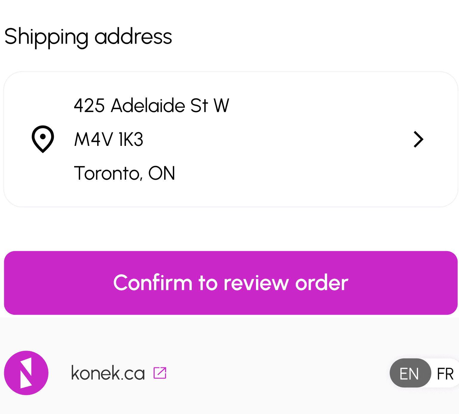
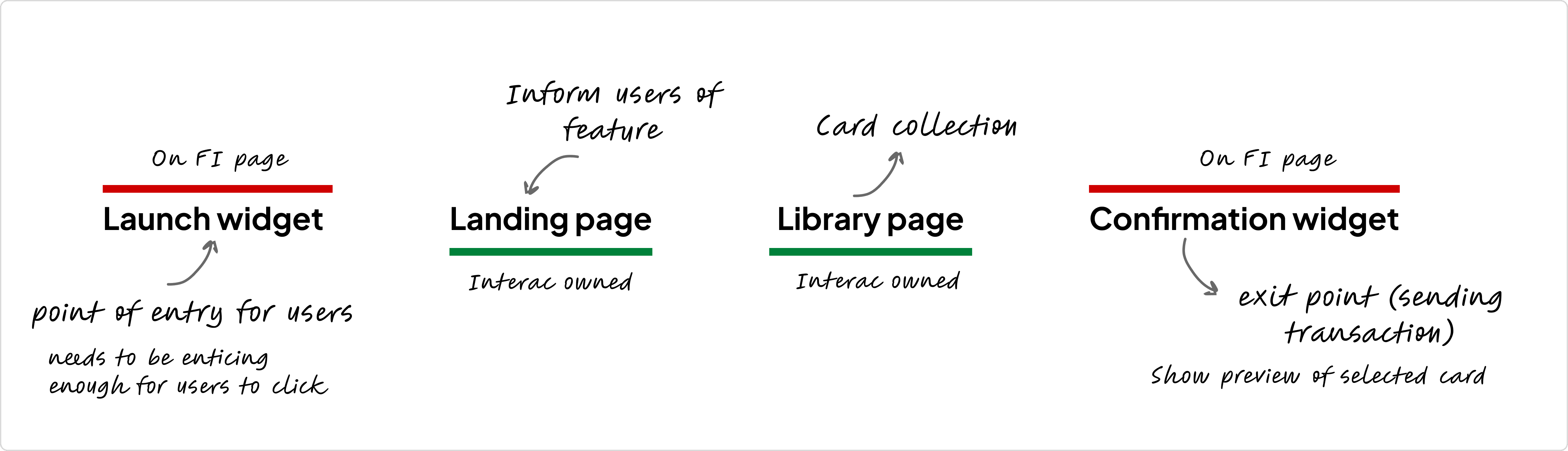
Since the users would see this feature from their FI app, the process needed to be as intuitive as possible. One of the main areas of concerns was the launch widget, which is a point of entry for users.
The design of the confirmation widget (after the card is selected) would be based off of this design.

Research

Findings
Creating a dynamic widget to appeal to users
To appeal to different demographics, we ensured that the widget can be changed dynamically throughout the year. For example, on Valentine's Day, we could change the widget to a corresponding card.

I could set this manually every few weeks!
I also changed the line to a swoosh to match the current e-Transfer notifications.
Decision III
Finding a Balance with Design & Interac Trust
The tone for Cards is fun, exciting, and colourful. It's meant to be a new way to send e-Transfers.
Interac, on the other hand, is a trusted, fintech. How can these two be balanced?
Incorporating brand into the designs
Adding both logos on the intro page helps with maintaining brand trust

Playing with error screens
Since these were (hopefully) low visibility screens, we could play with the designs.

Final Design
Results
9000+ cards sent
As of January, over 9000 cards have been sent since its launch in November with Meridian and DC Bank. This data is tracked by our data analytics team through Google Analytics.
We have also noticed certain keywords being searched which will inform future design decisions (like a search bar with trending categories!).
Next Steps
Onboarding the new PM, shaping product strategy, and representing users
cxxx