


Sneak Peek: Users preferred the redesign and we reduced the user clicks by 40%. The app is now market ready, saving the company revenue losses due to poor UX.
KONEK
An Interac payment gateway to facilitate the checkout experience. Check it out: https://konek.ca/en/
Work Project | Design Refresh | Product Release
10 min read

My Role
UX Design Intern — Design Systems, Visual Design | Team: PMs, Engineers, Researchers
Timeline
8 months — Launched in October 2024 (closed beta)
Overview
or dive into the process


The Current Version Exposed Many Users Complaints

The old designs lacked a modern feel and were frustrating to navigate.
Only 30% of users wanted to create an account, raising concerns about the market offering that KONEK provides.
As the overall experience was unappealing and failed to highlight benefits, users were hesitant to switch to KONEK from their current payment apps, which would mean lower conversion rates and higher churn rates.
A Brief Competitive Analysis Clarified KONEK's Market Offering

PayPal, Apple Pay, Square, and Stripe were some of the competitors of KONEK. However, it had several benefits over these solutions such as:
Instant payments
Integration with Canadian banks
Better security & brand trust
These benefits were not communicated to users in the designs and thus failed to capture their interest.
An Audit of KONEK Revealed Various Challenges Relating to Legal Compliance and User Experience
A video of the old design is shown below:
We conducted a design audit of the screens:

Cookie and Privacy Notice
The current notice failed to comply with legal requirements as users did not scroll through the terms and conditions before accepting them. This was brought to our team's attention and required an immediate and effective solution.
Individuals can select their preferred language before continuing. They will also be given a quick summary of what the app does (when downloading the app for the first time).
Landing Page
Our UX researchers conducted preliminary interviews with users and found that they were confused when it came to finding a starting point for KONEK. Return users were overwhelmed with the amount of information present on the screen.
Individuals can select their preferred language before continuing. They will also be given a quick summary of what the app does (when downloading the app for the first time).


Unnecessarily Long Process
Our research showed that the stepper created an appearance of a long process, increasing the likelihood of users abandoning their carts.
Individuals can select their preferred language before continuing. They will also be given a quick summary of what the app does (when downloading the app for the first time).
Overall, we found that there were several issues with the current UI including inconsistent designs.
When evaluating the screens, we also found that spacing, fonts, and sizing were inconsistent as there was no cohesive design system in place.
The Design Challenge
How might we create a better overall user experience for KONEK while highlighting the benefits offered by the product?
01.
The Constraints
We Encountered Some Barriers to Redesigning the Experience
Starting the redesign process in June, we had less than three months to hand off the designs to the developers. However, we were also focused on the long-term sustainability of the designs and aimed to establish a system to support it. We collaborated with the team to figure out the following constraints:

Some of the screens in our user flow were provided by financial institutions and could not be changed.

Tight Deadlines
We had less than three months to finalize the whole experience and hand it off to devs.

Legal Requirements
We were required to work closely with the legal team to ensure all designs are compliant with the law.
02.
North Star Design Principles
North Star Design Principles
To ensure alignment within the team, we created some overarching guidelines.
Minimal Cognitive Load
Users should be able to complete their checkout process in a few clicks without unnecessary steps and information This should hold true for both first time and return users.
Consistency and Trust
Designs should maintain uniformity across the experience. Interac's brand trust should be incorporated where necessary to assure users of KONEK's safety.
Error Prevention
Users should have guidance when performing each step during the checkout process and their banking information should be validated. If errors occur, users should be able to resolve them quickly.
03.
Teamwork Makes the Dream Work
Collaborating with a Cross-Functional Team
With the launch date confirmed in October 2024, we had little time to design. So, we decided to divide the experience up into sections, utilizing the new agile approach implemented by the company, and handed off designs to developers in chunks.
This approach was incredibly effective as we saw great progress in little time and were able to collect feedback quickly, allowing us to make iterations.
Phase III: Return User Experience
Phase IV: Additional Error Screens
Plan of Action
Tackling each challenge means we had to plan our milestones and create tickets accordingly.
04.
Starting from the Bottom
Mapping Out the User Flow Helped Us Identify Gaps and Account For the Number of Clicks.


The red boxes represent potential error scenarios that need a screen. The purple represent the user actions.
Conducting this exercise helped us understand the amount of clicks the user needs to take before paying on the merchant website.
05.
Accounting for Consistency
Creating a Design System
To ensure consistent designs that are easily accessible for the users and the developers, we created a comprehensive design system.

We added a title card for easy navigation and built out the entire design system in Figma, which was then approved and implemented to our designs. The team wanted to keep the same colours, so we worked around and checked for accessibility.

For each card, we added a definition and how it would be used.

This is how the Figma file was organized!
Each component was applied to the new designs, ensuring that devs can reuse these elements when coding.
06.
Creating the Designs
A Slightly Different Design Process….
Since we had a baseline of what the app should look like in terms of colours, I found it easier to directly make changes on the screens rather than drawing sketches. The developers were not looking to redesign the entirety of KONEK. They wanted to reuse as many elements as we could so we could meet the launch deadline.
After creating changes on the screen, we presented it to the broader team, seeking feedback from product managers and developers. Then, we iterated designs based on their feedback. Here's an example of the iterative process:
07.
Addressing the Challenges
The New Design for KONEK Addresses The Initial Challenges


08.
Final Solution
The new KONEK: where functionality meets design.
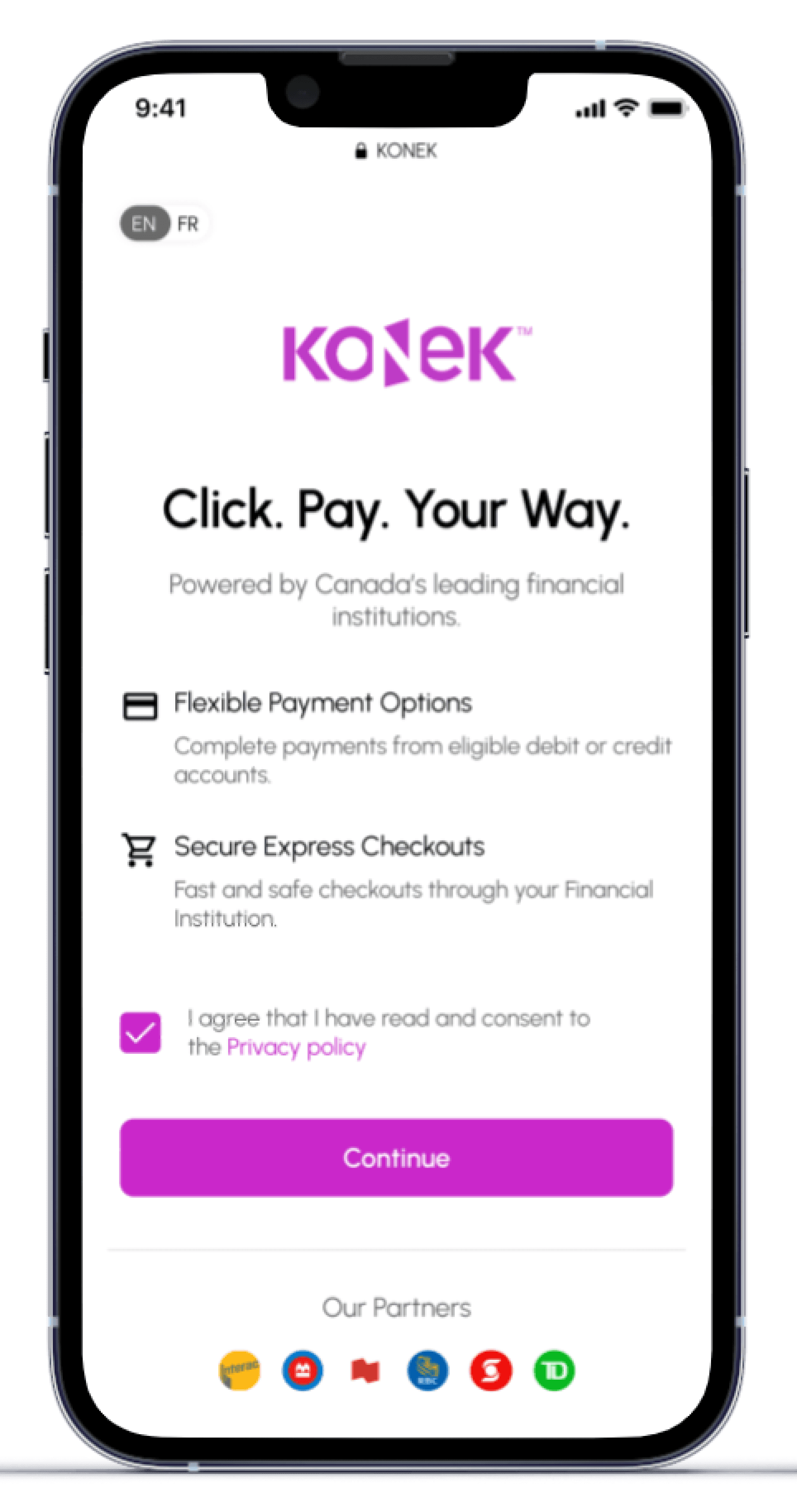
Clear, Concise, Compelling Onboarding.
Users are given necessary information when they first start using KONEK.
Removed the carousel to reduce cognitive overload and focused on communicating the benefits offered.
Emphasized partnerships with prominent financial institutions to build trust and credibility with users.
North Star Principle
Minimal Cognitive Load
North Star Principle
Consistency and Trust
A Smooth Checkout Process.
Users can easily checkout from their favourite merchants.
Removed the stepper to reduce cognitive overload.
Pulled data in from the user's bank so they only need to verify information vs input.
North Star Principle
Error Prevention
North Star Principle
Minimal Cognitive Load
Easy to Connect. Easy to Pay.
Once an account is created, return users securely pay with just one click!
Made the return experience consistent with competitors (Jakob's Law).
Made a dashboard for the user to perform actions easily.
North Star Principle
Consistency and Trust
The Whole Flow
Here's a video of the entire user experience - start to finish :)
After the changes were implemented by developers, we conducted initial user testing to compare the experience between V1 and V1.1 of KONEK. We found that 100% of users appreciated the change in UI and found it easier to navigate.
However, we found that some users were confused between the actions of authorizing the payment vs paying the merchant. This would be the next iteration to make!
09.
Outcomes
Some Metrics to Assess the New Design :)
PURE Study
Context: Usability evaluation method assigning one or more quantitative ratings to a design based on a set of criteria. It can be used to identify steps where users experience higher or lower levels of cognitive load.
Before redesign
29 clicks
Usability Testing
Context: Conducting usability testing with 20 Canadians
Before redesign
30% created an account
User Interviews
Context: 7 Participants were asked to rate the checkout experience from 1-7 (1 being very difficult and 7 being very easy
10.
Learnings
An Internship of Experience.
Collaborating with a cross-functional team
Taking design feedback and knowing when to advocate for design vs make changes was the biggest thing I learned. Some feedback that we received went directly against the user research we conducted, thus we had to defend our design decisions. However, keeping an open mind and taking constructive feedback was important for the success of the product launch!
Creating a comprehensive design system
After creating a design system in Figma, our process was drastically more efficient. Component changes were quick and could be universally applied to all designs. Our developers appreciated the system as well and gave us great feedback.
Design is an iterative process
In design, adopting a growth mindset is crucial. Since design is subjective, I received many conflicting opinions which were a challenge to navigate. However, by keeping user centric principles in mind, we were able to deliver designs that fulfilled both user needs and business objectives.
🐾 Next steps would be to conduct user testing with users and continue iterations!